
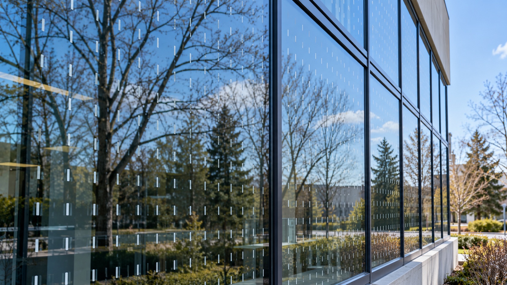
Bird-friendly film does not work because birds recognize a sticker, silhouette, or warning symbol. It works because a pattern breaks the continuous reflection of trees and sky into small enough spaces that a bird does not try to fly through it.
That is why almost every serious bird-glass standard lands in the same place: exterior markers, close spacing, high contrast, and treatment in the lower band where habitat reflections are most dangerous.
The pattern matters more than the product name
Toronto’s bird collision deterrence measure has historically asked for visual markers on at least 85% of exterior glazing within the first 16 metres above grade, with markers on the first surface, at least 5 mm wide, and spaced no more than 50 mm by 50 mm apart.1 CSA A460, Canada’s bird-friendly building design standard, uses the same practical idea: close, high-contrast exterior markers that birds can perceive before they reach the glass.2
The shorthand installers use is the “2-by-2 rule.” The open gaps between visible elements should be no more than about two inches in either direction. A single hawk decal in the middle of a pane does not do that. A field of dots, short lines, stripes, or a tested pattern can.
Exterior surface first, interior only when there is no other option
The pattern needs to interrupt the reflection before the bird reaches the glass. That is why first-surface, exterior application is the standard answer. Interior patterns can disappear behind reflections, especially on dark glass, reflective glass, or glass facing trees and open sky.
Existing buildings sometimes have access constraints: height, tenants, landscaping, winter conditions, or glass types that make exterior work more involved. Those constraints are real, but they do not change the physics. If the reflection is on the outside, the cue should be on the outside whenever possible.
Dots, lines, gradients and custom patterns can all work
The best pattern is the one that satisfies the spacing rule, remains visible in the actual light conditions, and still looks acceptable to the owner and tenants. Common choices include:
- Dot fields: the quietest option at distance, good for offices and condos that want the glass to stay visually calm.
- Short vertical markers: more visible up close, often cleaner on modern commercial elevations.
- Horizontal or vertical stripes: effective when the architecture can carry a stronger graphic rhythm.
- Custom graphics: viable when the designer respects the maximum open-gap rule instead of treating it like a mural.
The test is not whether the pattern looks bird-themed. The test is whether the pane still contains a large unbroken reflection of habitat. If it does, the design is probably too sparse.
Treat the glass birds are actually using
Most collision risk is concentrated where glass reflects vegetation, sky, water, interior plantings, pass-through corners, balconies and courtyard conditions. That makes a site walk more useful than a generic square-foot quote. The question is not only how much glass the building has. It is which panes are lying to birds.
For existing GTA buildings, we usually start with the first few storeys, corners, glass railings, lobby glass and panes facing trees. That is the band where a retrofit can do the most good without turning the entire elevation into a full-building graphics project.